
The Ultimate Guide to Color Psychology in Minimalist Art
The stereotype of the ‘sterile’ minimalist home—all white walls and cold grey furniture—is a thing of the past. Today’s minimalism embraces color, but in a very specific, psychological way. Understanding how different hues affect our mood can help you curate an art collection that isn’t just beautiful, but also therapeutic. This is the core of Color Psychology in Minimalist Art: using intentional palettes to create a sanctuary of calm.
The Warmth of Greige and Sand: Foundation of Modern Minimalism
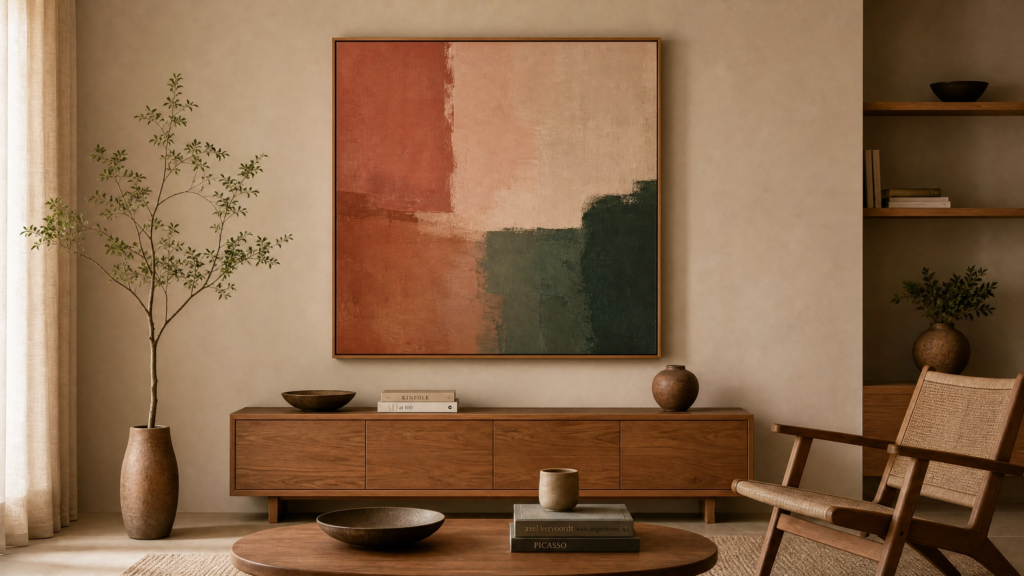
Warm neutrals are the foundation of modern minimalism. Unlike stark white, which can feel clinical, sandy tones and ‘greige’ (a mix of grey and beige) evoke a sense of security and timelessness. In the realm of Color Psychology in Minimalist Art, these colors are known to lower heart rates and reduce visual stress. They provide a soft backdrop that allows the textures of your art to shine, making them perfect for large living rooms where you want to feel grounded and at peace.
Sage Green: The Color of Rest and Connection to Nature
Green is the most restful color for the human eye. In a minimalist setting, muted sage or olive tones in art can lower stress levels and create a connection to nature. It’s the perfect choice for bedrooms or home offices where focus and tranquility are required. Many professional curators at Saatchi Art suggest that bringing organic greens into a room bridges the gap between the outdoors and your interior, a key principle of Color Psychology in Minimalist Art.
Terracotta and Ochre: Bringing Grounding Energy to Your Home
Earthy reds and yellows bring a ‘grounding’ energy to a space. These colors are associated with the sun and the earth, providing a subtle warmth that prevents a minimalist room from feeling too ‘unlived-in.’ When applying Color Psychology in Minimalist Art, use these tones sparingly as focal points. A single terracotta abstract piece can add enough ‘soul’ to a room to make it feel welcoming without compromising the clean lines of your minimalist design.
Muted Blues: Achieving Serenity and Depth with Color Psychology
A soft, dusty blue can add a sense of infinite space to a room. It’s a color that suggests the sky or the ocean, promoting deep breathing and a sense of openness.
The Role of Lighting in Color Psychology
In the context of Color Psychology in Minimalist Art, lighting is the silent partner that brings your palette to life. Natural sunlight can enhance the warmth of terracotta tones, while cool LED lighting might make your muted blues feel even more serene. When curating your space, consider how the time of day affects the emotional impact of your chosen art. At Prime Vista Art, we often recommend viewing pieces in different lighting conditions to ensure the psychological benefits remain consistent. By mastering the interplay between light and color, you create a dynamic minimalist environment that evolves with the sun.
Conclusion: Curating Your Life with Color Psychology in Minimalist Art
Ultimately, the colors you choose for your home are a reflection of your inner state. By mastering Color Psychology in Minimalist Art, you transform your walls from simple surfaces into emotional anchors. At Prime Vista Art, we specialize in sourcing pieces that embody these principles, helping you build a collection that is both modern and meaningful. Explore our curated gallery today to find the perfect palette for your vision. Remember, a well-chosen color isn’t just a design choice—it’s a lifestyle of sophistication and serenity.
The Future of Color in Minimalist Design
As we look toward 2026, the application of Color Psychology in Minimalist Art is becoming more sophisticated. We are moving away from monochromatic boredom and towards ‘soulful minimalism.’ This means choosing colors that not only look good under gallery lights but also improve your daily mental well-being. At Prime Vista Art, our mission is to help you navigate these choices, ensuring that every piece you acquire serves as a pillar of serenity in your home. By understanding the deep emotional resonance of each hue, you are not just decorating a room; you are curating a life of balance and beauty.