
Minimalist Color Psychology is not merely about choosing a paint swatch; it is a sophisticated study of how subtle hues and textures influence our subconscious well-being. In the realm of high-end interior design, the colors we choose for our walls and the art that inhabits them act as silent orchestrators of our daily emotional state. By understanding the principles of Minimalist Color Psychology, we can transform a static living space into a dynamic sanctuary that restores balance, focus, and tranquility.
I. The Purity of White: A Mental Blank Canvas
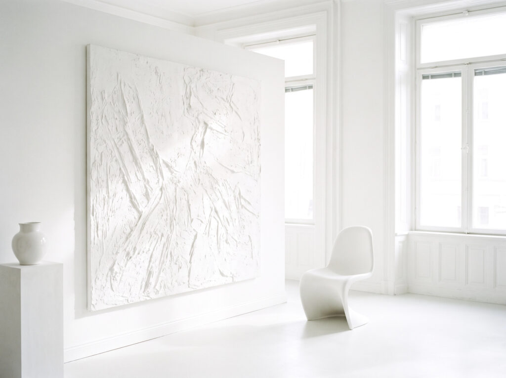
In Minimalist Color Psychology, white is the ultimate symbol of clarity and possibility. It is not a void, but rather a “visual silence” that allows the mind to decompress. A white-on-white minimalist interior, anchored by a textured white painting, creates an ethereal atmosphere that feels mentally clearing.
As we discussed in our exploration of [Minimalist Art and Slow Living], the absence of visual noise is the first step toward inner order. White reflects the maximum amount of light, expanding the perceived boundaries of a room and providing a sense of limitless potential. It is the perfect starting point for any [Private Art Gallery] at home.
II. The Warmth of Beige: Grounding the Soul
While white provides clarity, beige and sandy neutrals provide grounding. Minimalist Color Psychology identifies these warm tones as essential for creating a sense of safety and comfort. Unlike sterile, cool tones, beige carries a hint of organic warmth that resonates with our primal need for shelter.
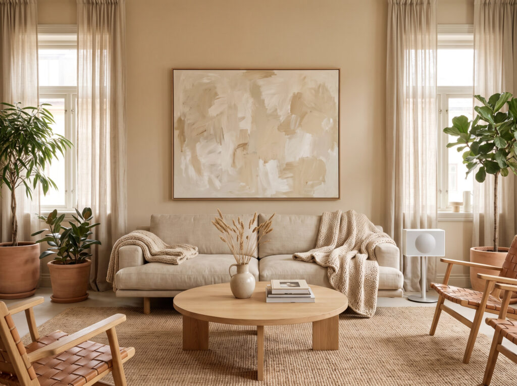
A living room featuring art in shades of cream, oatmeal, and light tan fosters a welcoming environment without sacrificing the minimalist aesthetic. These tones are particularly effective when paired with natural materials, creating a cohesive narrative that emphasizes quality over quantity.
III. Grey-Blue Serenity: The Rhythm of Rest
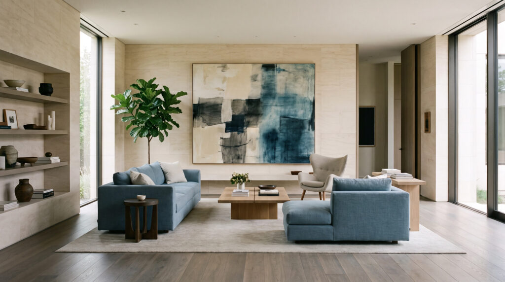
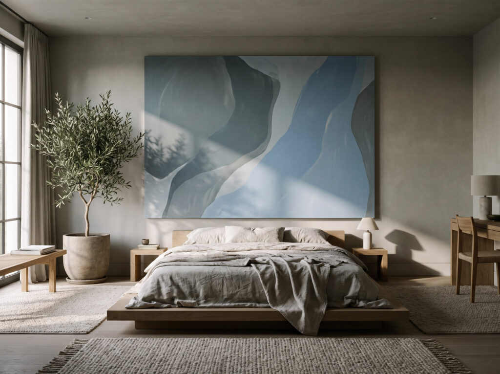
For spaces dedicated to rest, such as bedrooms or private studies, Minimalist Color Psychology leans heavily into muted grey-blues and powder blues. These colors are scientifically known to lower heart rates and reduce anxiety, mimicking the calming effect of a clear twilight sky or a still body of water.
A large abstract painting in these tones acts as a visual sedative. When combined with the principles of [Art Lighting for Collectors], where soft, indirect light can unveil the subtle gradients of blue, the space becomes a true sanctuary for deep rest and reflection.
IV. Earthy Undertones: Connecting with the Organic
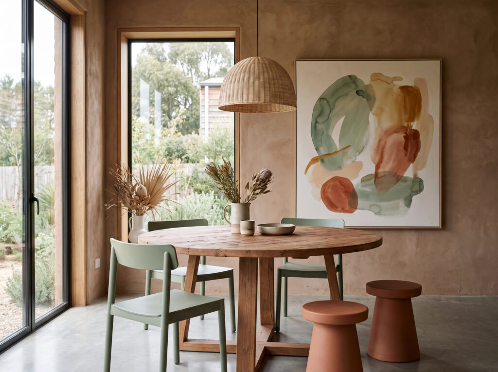
Minimalism is increasingly moving toward “Warm Minimalism,” which incorporates earthy undertones like sage green, terracotta, and clay. Minimalist Color Psychology suggests that these colors foster a deep connection to the natural world, even within an urban environment.
In a dining space or common area, art that reflects these organic colors brings a sense of life and growth. To ensure these pieces don’t overwhelm the space, consulting a [wall art size calculator] is vital for maintaining the perfect architectural equilibrium.
V. The Strategic Accent: Emotional Punctuation
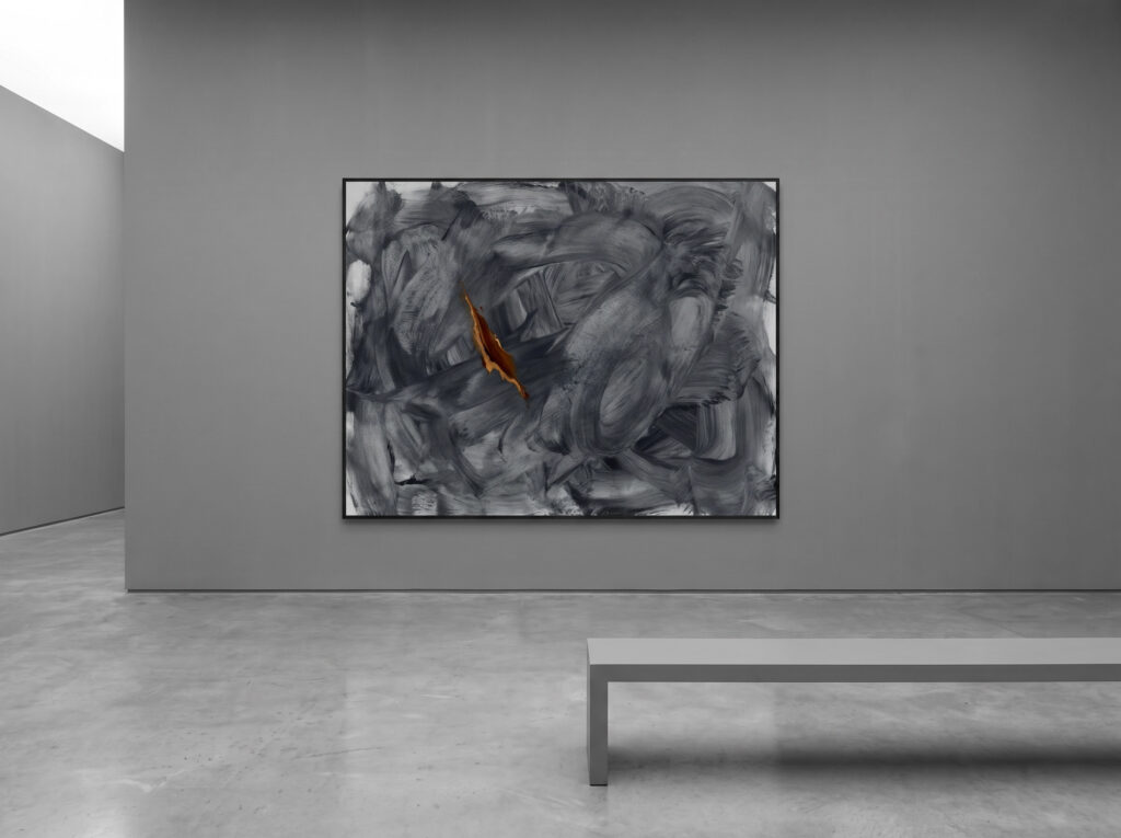
A common misconception is that Minimalist Color Psychology forbids bold colors. In reality, minimalism uses color strategically as “emotional punctuation.” In a monochromatic grey space, a single abstract painting with a deliberate accent of burnt orange or deep ochre can ignite creativity and focus.
This technique prevents a minimalist home from feeling monotonous. The accent color becomes a focal point, drawing the eye and providing a burst of energy that is contained and intentional. Platforms like [Saatchi Art] offer a wealth of minimalist works that master this balance of restraint and impact.
VI. Light and Color Interaction: The Dynamic Mood
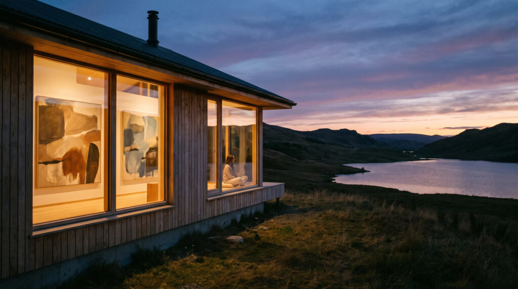
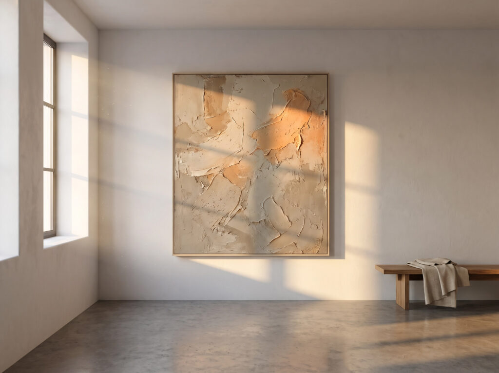
One of the most fascinating aspects of Minimalist Color Psychology is how color changes with light. A textured painting that appears warm and inviting in the morning sun may feel cool and introspective in the blue hour of twilight.
Understanding this interaction is key to professional curation. The way light hits a textured canvas doesn’t just change the color; it changes the mood of the entire room. By mastering the interplay of light and hue, you can ensure your collection remains a living, breathing part of your home’s atmosphere.
VII. The Gallery Journey: A Cohesive Narrative
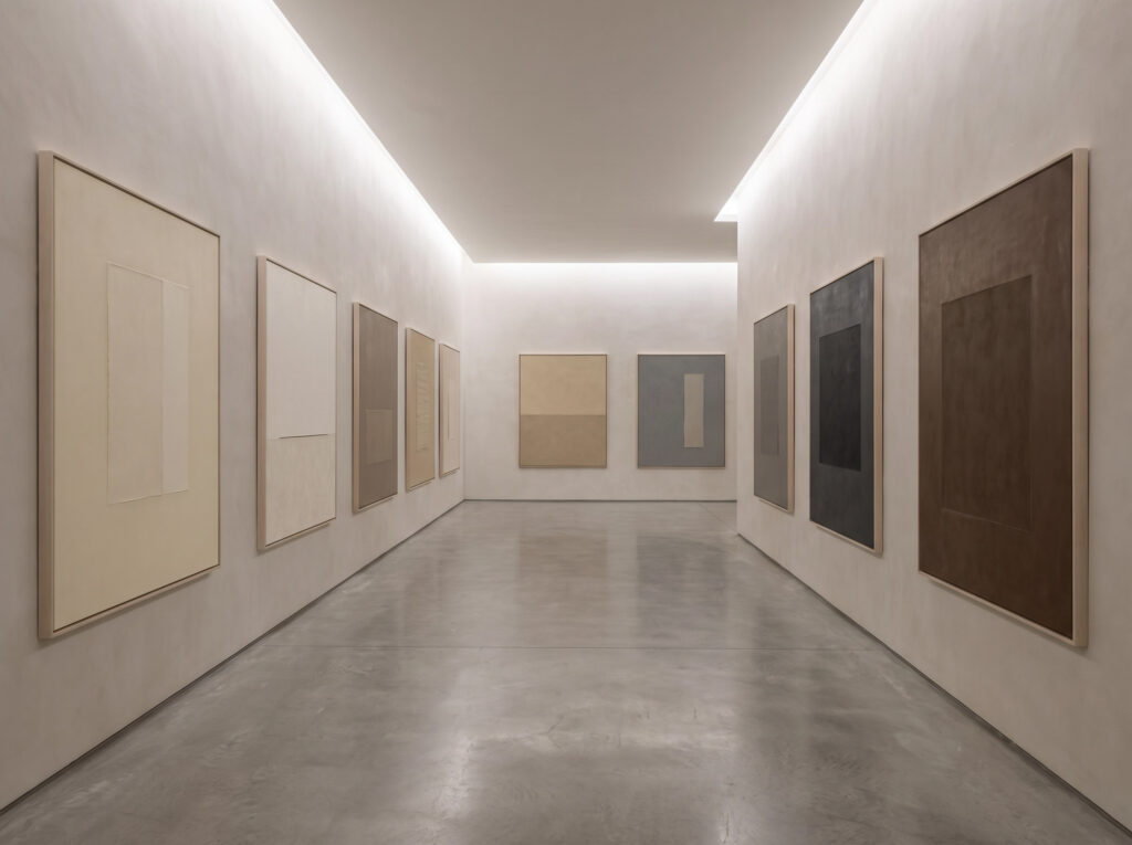
Finally, Minimalist Color Psychology is about the journey through a space. A long hallway acting as a gallery, with a series of works in varying neutral tones, creates a rhythmic emotional experience. Each piece serves as a transition, guiding the viewer from the high energy of a living area to the quiet contemplation of a private room.
This cohesive narrative is what separates a collection of objects from a curated gallery. It requires a holistic view of the home, where every color and every shadow is part of a larger, intentional story.
Conclusion: Curating Your Emotional Landscape
Curating a home is, at its heart, an act of curating your own emotional landscape. Through the lens of Minimalist Color Psychology, we see that every hue is a tool for restoration and inspiration. By choosing art that speaks to the soul through the language of color, you create a space that does not just look beautiful, but feels profoundly right.